
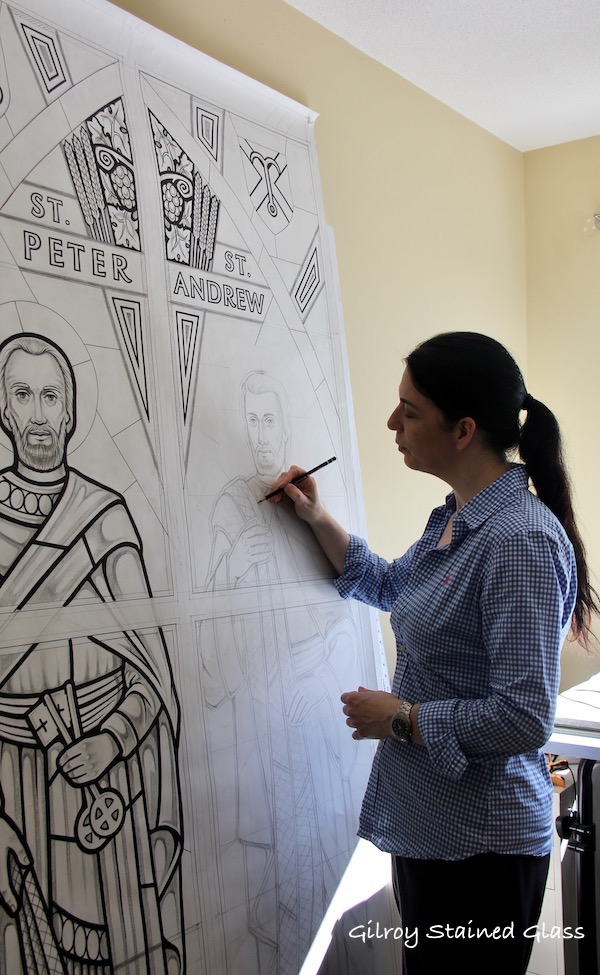
I’m well underway with the cartoons (full size drawing) for our 12 Apostles 154 square ft window – it’s a lot of figurative drawing for sure! Pictured here is when I was doing the first two sections, when the Peter cartoon was finished and I was drafting the Andrew figure.
Some of you may remember previous postings when I sometimes complete a cartoon in grades of pencil work and other times I use black ink with some pencil work. Often it’s not until the cartoon is underway that I decide which. With some of my designs I see the images in layers, and using ink for certain elements will help to solidify that concept for me. Often with a larger cartoon that that spreads across various structural divisions, I use ink to strongly mark the lead lines and trace lines (the lines to be painted on the glass that convey the details of faces and hands etc). For me, this will bring the “skeleton” of the design sharply to the surface. You artists out there may feel as I do that this “skeleton” to an artwork is what gives it its strength and draws the viewer in; everything after that emphasizes and builds on it. Conversely, and somewhat contradictory to what I just said, some smaller cartoons are better emphasized with grades of pencil giving equal weight to to the structure and flow of the path of the design as well as the tonal values. Sometimes you just have to go with the flow….